Society Management System (SMS)
Turning a technical society-management website into a mobile app for residents, admins and guards — and learning, along the way, that I couldn't design screens before I understood the people using them.
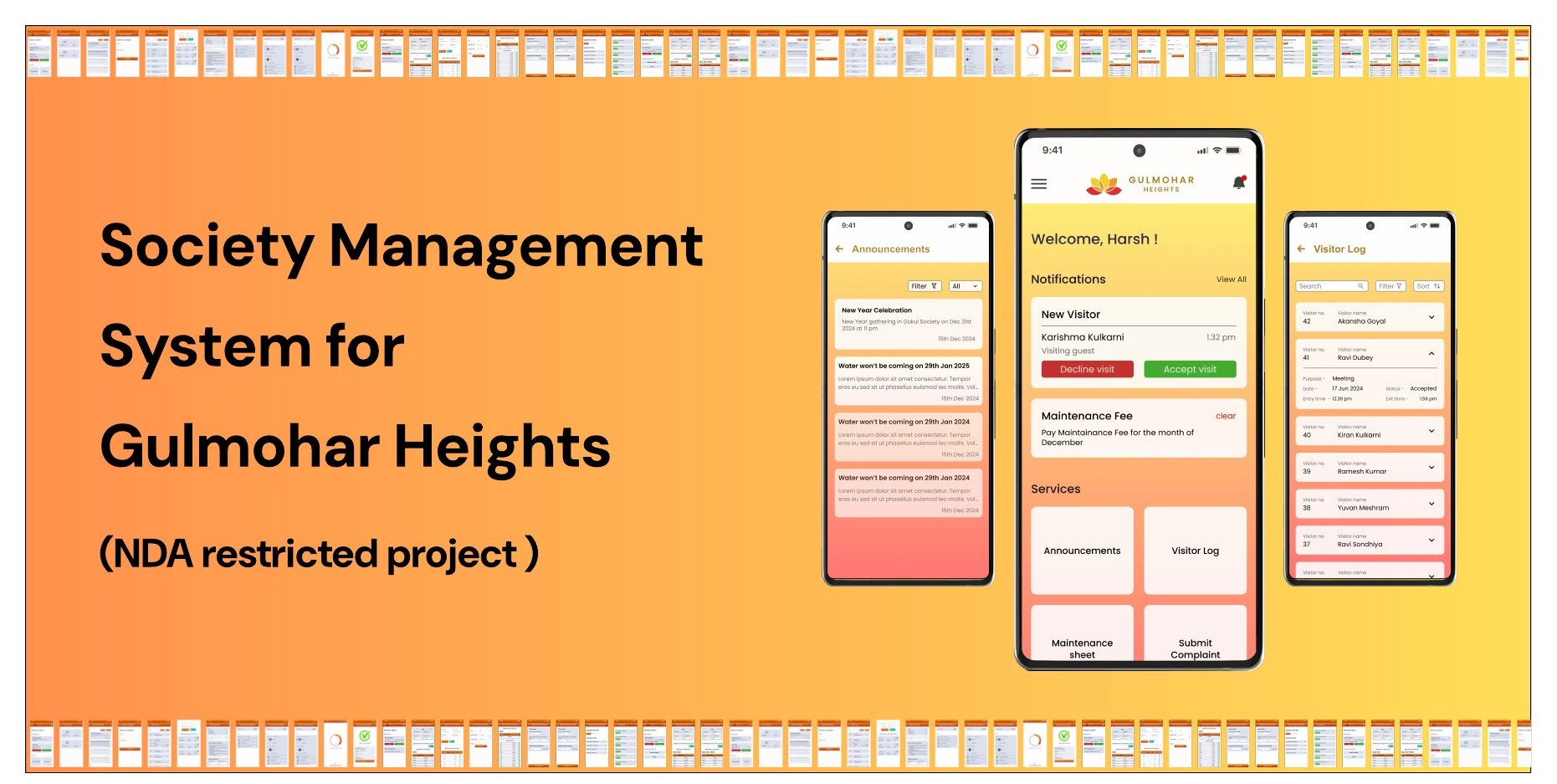
NDA-restricted project. The name, fonts and colours have been changed, and only partial resident screens are shown. Admin and guard screens are intentionally withheld.
- Role
- Product Designer
- Users
- Resident / Tenant · Admin · Guard
- Platforms
- Website + Mobile app
- Scope
- Redesign, app design, multi-role flows
- Team
- 2 designers, with a team lead
- Timeline
- Evolving scope — no fixed timeline
The project at a glance
Context
The hard part
My contribution
Delivered
What is a Society Management System?
A digital tool that simplifies how residential communities manage daily tasks, communication and security — without endless WhatsApp groups and calls to the watchman.
Maintenance payment
Pay society dues online.
Raise a complaint
Log and track issues without chasing anyone.
Book a facility
Reserve the clubhouse, gym or halls in a few taps.
Track visitors
Stay updated on who's entering and leaving.
Announcements
Get updates from the society admin.
Manage residents
Keep resident details and communication organised.
Designing in a moving environment
The project wasn't linear. It moved through three phases, and the second one changed how I work.
Phase 1
Blind redesign
Two designers, two hours, and a UI redesign of an existing SMS website — with little to no context.
Phase 2
Website → app
I started turning the website into an app. After 2–3 screens I was doubting every decision, because I didn't know the context. How could I design without understanding the users?
Phase 3
Learn, question, iterate
I asked the team lead questions, found problems in the design, and absorbed client changes — updating the website and app at the same time.
The moment I got stuck in Phase 2 was the most useful part of the project — it showed me I needed context before pixels.
How I worked, flow by flow
The website had no home screen for any user, so I started there with the resident. Then, for each flow (for example, paying the maintenance bill), I studied the existing website's order of actions and placement of information, looked at the same flow in competitor apps, sketched in my notebook, iterated, and only then moved into Figma.
Research, sketching and UI design looped back and forth. Once the resident was done, I repeated it for admin and guard.
Direct research
Indirect research
Note
Fitting a visitor log onto a phone
Problem
Exploration
Insight
Decision
Edge case
Building it as a system
I built the collapsed and expanded cards, turned them into components, prototyped them, combined them into a component set, and placed the list in vertical auto layout — so opening one card pushes the rest down instead of overlapping.
A year of payments, without overwhelming the admin
The admin maintenance sheet held a year's worth of payment data per resident. Before designing, I asked one question: what would admins actually do on this screen?
Not: scroll endlessly through every month for every resident.
Hierarchy
Filtering
The new problem
Chips
Sidebar or bottom navigation?
For the resident alone, either would work. The decision had to work for the whole system.
Bottom navigation
- Fits the resident's 4–5 main flows
- Can't hold the admin's many flows
- Would mean different navigation per role
- No room for future flows
Sidebar Chosen
- Handles the number of flows across roles
- One pattern everywhere — consistency and standards
- Easier to extend if flows are added later
Why a notification section, when there's already a bell?
Many of the app's users are senior citizens. From personal experience, I know many elders don't notice the tiny notification dot. Phone notifications get lost in a long list, or deleted by mistake.
How do we make sure important updates are actually seen?
Passive vs active
Real-world model
Inspiration
The resident app screens
Home, announcements, visitor log, maintenance sheet and the payment flow. A few details: unread notifications in a darker colour, an upload-receipt button for those who've already paid, upload and download receipt in a single flow, a snackbar confirming actions, and payment information ordered like an electricity bill.
Admin screens
Withheld under NDA
Guard screens
Withheld under NDA
Change was the constant
Second-hand brief
Changing scope
Two surfaces
Deadline day
Where it landed
The website and app designs for resident, admin and guard flows were handed off to developers in Figma. I don't have usage data or test results, so I'm not claiming any — the value of this project is in the decisions above.
If I had more time
These are planned improvements, not completed work.
What I learned
Context before screens
Phase 2 taught me that designing without knowing users and workflows produces doubt, not design.
Hierarchy is the real tool
Small screens force you to decide what matters first. Priority, then progressive disclosure.
Borrow patterns from anywhere
Food delivery, payments and shopping apps solved my problems before SMS apps did.
Components save the day
Styles and component sets made iteration — and the last-minute rebrand — fast.
Think in systems, not roles
Navigation for three user types had to be decided once, for everyone.
Happy paths aren't enough
Edge cases, and knowing when to add or remove screens, are where flows hold up or fall apart.
Want the full walkthrough?
Admin and guard flows can be discussed under NDA on request.